
 Case study / 2025
SHREEMAY BUNGALOWS.
Shreemay Bungalows — Real Estate • Brochure
Industry
Real Estate & Premium Residential
Design style
Editorial luxury, modern Indian real estate, warm minimalism, architectural calm
Target audience
HNI and upper-mid Indian home buyers aged 30–55, NRI investors and channel partners evaluating premium bungalow projects.
Project overview.
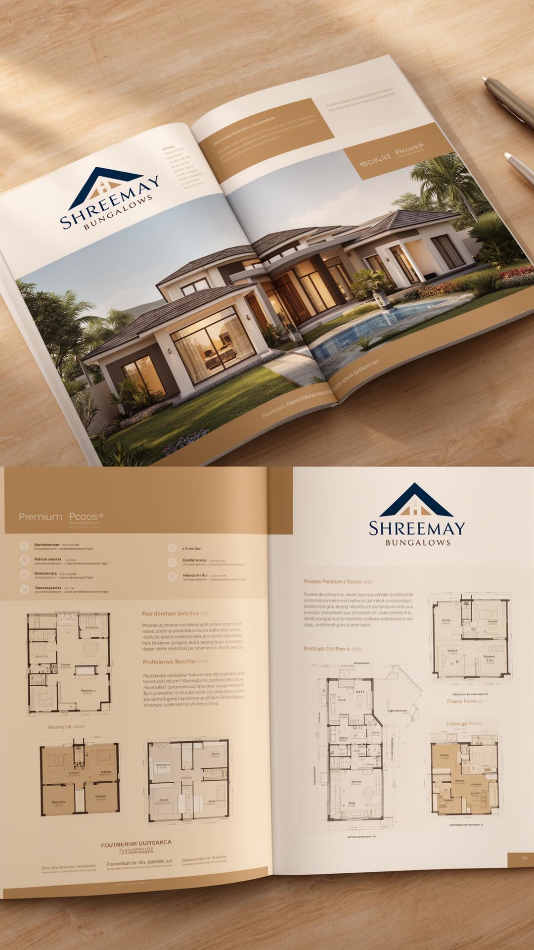
Shreemay Bungalows is a premium residential bungalow project that needed a sales brochure built to do the heavy lifting of a site visit on its own. We designed a complete editorial brochure system — covers, lifestyle spreads, amenity pages, floor plans and specifications — that holds dense information without losing the luxurious lifestyle promise.
Client
Shreemay Bungalows
Year
2025
Discipline
Real Estate • Brochure
Duration
10 working days (brief to print-ready)
My role
Editorial & Print Designer — layout, typography, image direction and pre-press
The client problem.
Indian premium real estate brochures often fall into two traps — either over-designed lifestyle imagery with no real information, or info-heavy PDFs that read like spec sheets. Shreemay needed a brochure that respected both: a high-end lifestyle story up front, and clear, scannable floor plans and specifications behind it.
Design goal.
Design a premium real estate sales brochure for Shreemay Bungalows that elevates perceived project value, communicates lifestyle and layout with equal clarity, and converts walk-in buyers into confident decision-makers.
Our solution.
A structured editorial grid built on warm beige and rich brown tones, balanced by a muted blue accent. Architectural renders sit alongside clean modern typography and curved framing elements to keep the read premium, calm and easy to navigate from cover to specification page.
The strategy.
Treat the brochure as an architectural product. Use a strict editorial grid, premium paper-feel colour, generous whitespace and clearly hierarchised information so dense data feels designed, not dumped.
Colour palette
- Warm Beige#E7D9C2
- Rich Brown#5C4327
- Muted Blue#3E5C76
- Ink Charcoal#1E1E1E
Typography
Modern editorial serif for section openers
Clean humanist sans for specs, captions and floor plans
Design process
Step-by-step.
- 01
Project requirement deep-dive with sales team
- 02
Layout planning & wireframing
- 03
Typography & colour system
- 04
Image curation & architectural render placement
- 05
Floor plan & specification design
- 06
Print optimisation & pre-press handover
Deliverables
- → Front & back covers
- → Lifestyle and project story spreads
- → Amenity & specification pages
- → Floor plan layouts
- → Print-ready CMYK files with bleed
Tools used
Mockup presentation
In the world.
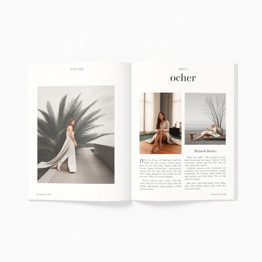
Final brochure showcased as a real printed sales tool in walk-in scenarios — covers, spreads and floor plans presented as they appear in the sales lounge.

Social media applications
- → Project teaser carousels
- → Floor plan reveal posts
- → Lifestyle campaign visuals
Print & packaging
- → Premium printed sales brochure
- → Walk-in counter collateral
- → Channel partner kit
Final outcome & result
The brochure became the primary sales tool for the launch and was credited by the client with raising the perceived value of the project during buyer walk-throughs — directly supporting premium pricing conversations.
A premium real estate brochure that turns dense project data into a calm, confident, conversion-ready sales experience.
Applications
- →Front & back brochure
- →Property information layout
- →Print-ready files
Client feedback
“The brochure does half the selling for us before we even start speaking. It made the project feel exactly as premium as it is.”
— Sales Head, Shreemay Bungalows
Have a brand worth building?
Let’s craft your next case study.
Branding, identity, packaging, print and digital — built for Indian businesses ready to look as serious as they actually are.
Next project →
AGAR SWEETS.
Food • Catalogue