 Case study / 2025
RIKTAA HEALTHCARE.
Riktaa Healthcare — Healthcare • Identity
Industry
Healthcare & Pharmaceuticals
Design style
Modern Indian healthcare, warm-minimal, editorial-clinical, human-centric
Target audience
Indian patients aged 22–55, doctors and clinicians, hospital procurement teams, pharmacy partners and B2B healthcare distributors looking for a reliable, modern healthcare brand to associate with.
Project overview.
Riktaa Healthcare is a new-age Indian healthcare brand built on the promise of energising lives through accessible, trustworthy medical care. We crafted a complete brand identity system — from the monogram and wordmark to clinical stationery and patient-facing collateral — designed to position Riktaa as a warm, modern and recall-driven healthcare name in the Indian market.
Client
Riktaa Healthcare
Year
2025
Discipline
Healthcare • Identity
Duration
5 working days (concept to launch kit)
My role
Brand Identity Designer & Creative Director — strategy, logo design, typography, colour system and rollout
The client problem.
The Indian healthcare branding space is dominated by clinical blues, generic crosses and templated logos that fail to build emotional trust. Riktaa, as a freshly launched healthcare brand, needed an identity that communicated medical credibility, human warmth and energising vitality at the same time — a mark that could live confidently on a prescription pad, a hospital signboard, a medicine strip and a digital ad without losing meaning at any scale.
Design goal.
Design a future-ready healthcare brand identity for Riktaa that signals trust, energy and care, builds instant recall in a crowded Indian healthcare market, and works seamlessly across print, packaging, signage and digital touchpoints.
Our solution.
We engineered a custom RH monogram softened by a curved, face-like inner element symbolising the human side of healthcare. The monogram is paired with a confident contemporary serif wordmark and a warm hand-script tagline — ‘Energising Lives’. The deep red and warm orange palette communicates vitality, while charcoal and a grounding natural green signal medical professionalism and balance.
The strategy.
Position Riktaa as a healthcare brand that feels human-first rather than hospital-first. Lead with a symbolic monogram, support with a trustworthy serif wordmark, and anchor every touchpoint in a vitality-driven red-orange palette so patients recognise the brand long before they read the name.
Colour palette
- Riktaa Red#C8102E
- Energy Orange#F47B20
- Clinical Charcoal#1F1F1F
- Care Green#2E7D5B
- Paper White#F8F5F0
Typography
Custom Serif Wordmark (humanist serif family)
Geometric Sans (Inter / Neue Haas Grotesk pairing)
Hand-script accent used only for the tagline ‘Energising Lives’ to keep emotional warmth.
Logo concept
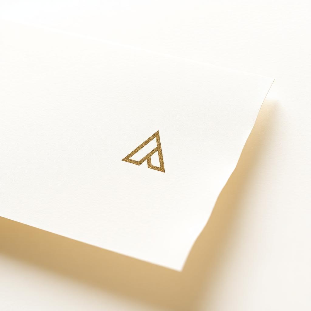
The mark fuses ‘R’ and ‘H’ into a single confident monogram. The negative space inside the form reads as a calm human profile — a quiet nod to patient-first care. The serif wordmark adds clinical credibility, while the script tagline reinforces the emotional promise of energising lives.
Design process
Step-by-step.
- 01
Brand discovery & healthcare market research
- 02
Symbol exploration & monogram sketching
- 03
Typography pairing & wordmark refinement
- 04
Colour system & contrast accessibility testing
- 05
Stationery, signage & launch kit rollout
Deliverables
- → Primary logo & monogram
- → Logo variations (monochrome, reverse, stacked, horizontal)
- → Brand colour & typography guidelines
- → Letterhead, visiting card, envelope, ID card
- → Prescription pad & clinical print system
- → Digital launch kit (social profile, banner, signature)
Tools used
Mockup presentation
In the world.
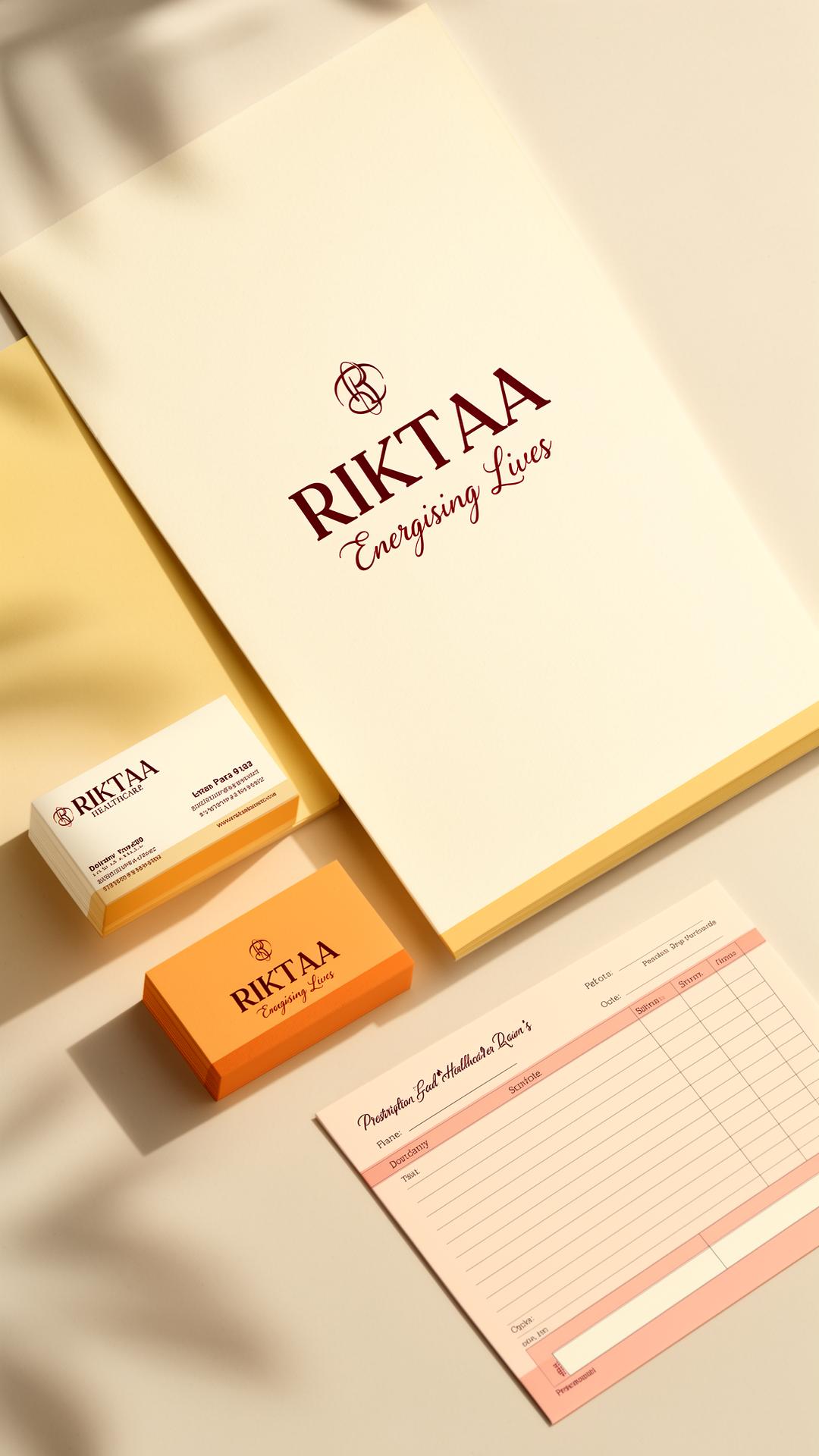
Identity presented across realistic Indian healthcare touchpoints — clinic signboard, prescription pad, doctor’s coat ID, medicine carton and Instagram launch post — to validate scalability before rollout.
Social media applications
- → Instagram launch reveal grid
- → LinkedIn brand introduction post
- → WhatsApp business profile & broadcast banner
- → YouTube channel art for awareness videos
Print & packaging
- → Letterhead, visiting card & envelope suite
- → Prescription pad & patient file folder
- → Clinic signage & wall branding
- → Medicine packaging mock & carton
Before vs after
Earlier reference material relied on stock crosses and generic blue gradients with low recall. The new Riktaa system replaces that with a proprietary monogram, an ownable red-orange palette and a confident serif voice that finally looks like a brand, not a template.
Final outcome & result
The complete Riktaa Healthcare identity was delivered and rolled out across clinical stationery, packaging and digital touchpoints within 5 working days. The client reported instant brand recall in patient-facing materials and a noticeably more premium reception from B2B distributors during the launch phase.
A future-ready Indian healthcare brand identity built to energise lives — equally at home on a hospital signboard, a medicine carton and a doctor’s Instagram bio.
Applications
- →Primary logo & monogram
- →Monochrome & colour variations
- →Stationery suite
- →Print & digital launch assets
Client feedback
“Malhar understood the soul of Riktaa from the very first call. The identity feels warm, modern and unmistakably ours — exactly what Indian healthcare branding needs.”
— Founder, Riktaa Healthcare
Have a brand worth building?
Let’s craft your next case study.
Branding, identity, packaging, print and digital — built for Indian businesses ready to look as serious as they actually are.
Next project →
KUDARAT CARE.
Wellness • Branding