
 Case study / 2025
KUDARAT CARE.
Kudarat Care — Wellness • Branding
Industry
Wellness, Beauty & Personal Care
Design style
Premium organic, modern Indian wellness, quiet luxury, editorial minimalism
Target audience
Conscious Indian consumers aged 24–45, urban wellness shoppers, D2C beauty buyers and gifting customers looking for clean, premium, plant-based personal care brands.
Project overview.
Kudarat Care is an Indian natural wellness and beauty brand rooted in plant-based, ethical, slow-living values. We built a complete brand identity and packaging system that positions Kudarat Care as a premium yet calming wellness label, capable of holding its own next to international clean beauty brands on Indian shelves and D2C storefronts.
Client
Kudarat Care
Year
2025
Discipline
Wellness • Branding
Duration
12 working days (strategy to packaging-ready files)
My role
Brand Identity & Packaging Designer — strategy, logo, packaging system and guidelines
The client problem.
India’s natural wellness category is overflowing with green-and-leaf logos, generic ayurvedic visuals and packaging that feels either too clinical or too craft-fair. Kudarat Care needed a refined, premium identity that could communicate purity, nourishment and modern Indian wellness without falling into outdated cliches — and scale across packaging, retail, social and D2C ecommerce.
Design goal.
Create a premium-yet-calming wellness brand identity for Kudarat Care that signals natural purity, modern Indian craft and shelf-ready luxury, while remaining flexible enough for skincare, haircare and personal care extensions.
Our solution.
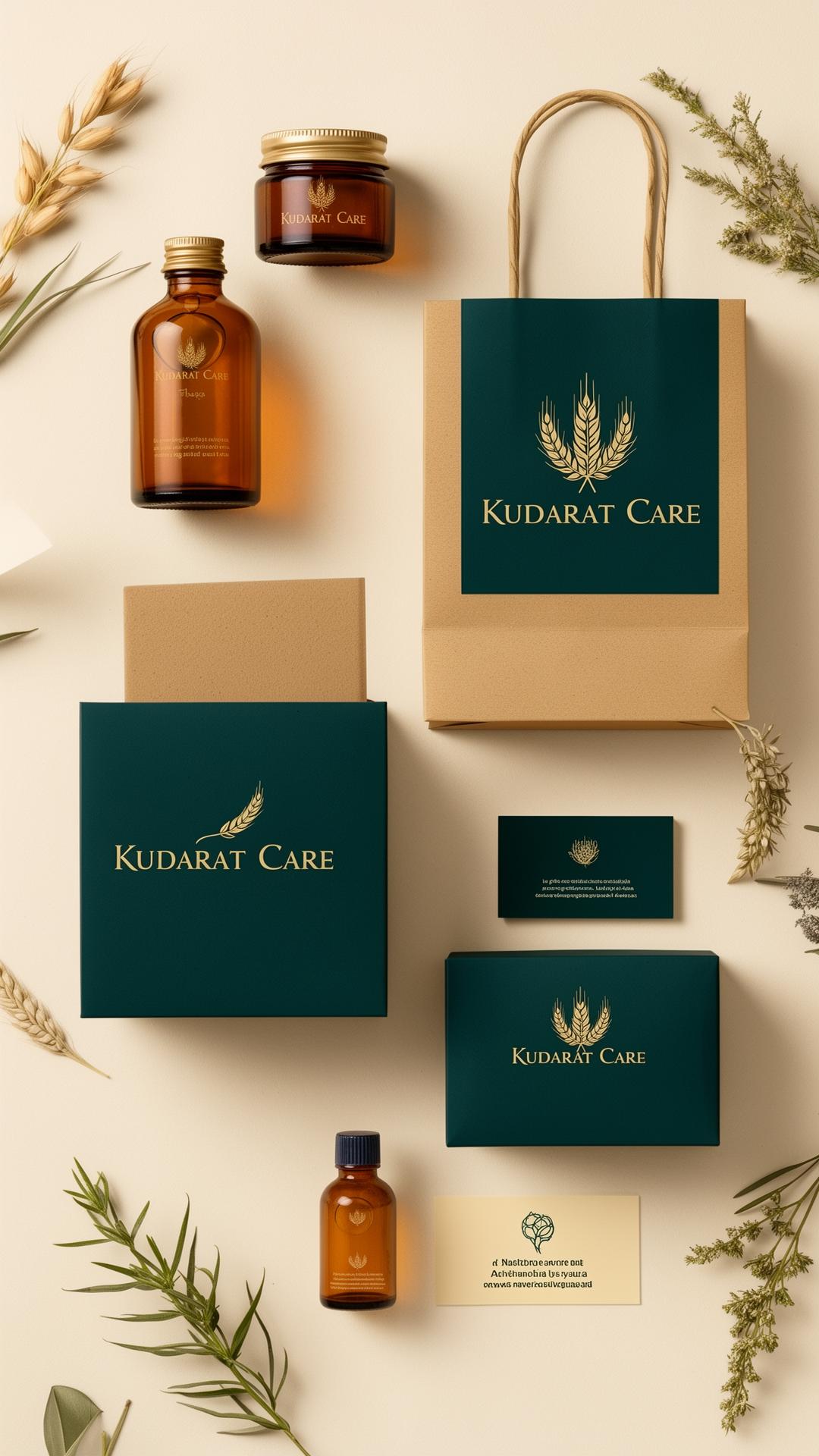
A custom wordmark fused with a wheat-inspired symbol to root the brand in nourishment and growth. A quiet, luxurious palette led by deep teal green and golden beige carries through packaging, business cards, shopping bags and digital touchpoints — building a coherent, premium wellness world.
The strategy.
Lead with restraint. Use a calm palette, generous negative space and a custom wordmark to instantly separate Kudarat Care from the noisy organic shelf. Treat packaging as the primary brand asset and design every other touchpoint to extend that shelf-first language.
Colour palette
- Forest Teal#1F4D45
- Golden Beige#C9A96E
- Soft Cream#F3ECDE
- Charcoal Ink#1A1A1A
Typography
Custom hand-tuned serif wordmark
Modern grotesque sans for system text
Letterforms tuned for premium feel on uncoated stock and small-size packaging.
Logo concept
A handcrafted wordmark grown from a stylised wheat-leaf symbol — a quiet visual cue for nourishment, fertility and growth. The mark reads as both botanical and editorial, allowing Kudarat Care to feel rooted in Indian agriculture and globally premium at once.
Design process
Step-by-step.
- 01
Brand discovery & wellness market audit
- 02
Moodboard & visual direction
- 03
Logo concept sketching & wordmark refinement
- 04
Typography & colour system
- 05
Packaging system & shelf testing
- 06
Brand identity guidelines
Deliverables
- → Primary wordmark & symbol
- → Logo variations & lockups
- → Colour & typography guidelines
- → Packaging system (bottle, tube, carton)
- → Business cards, shopping bags, hangtags
- → Brand identity guidelines PDF
Tools used
Mockup presentation
In the world.
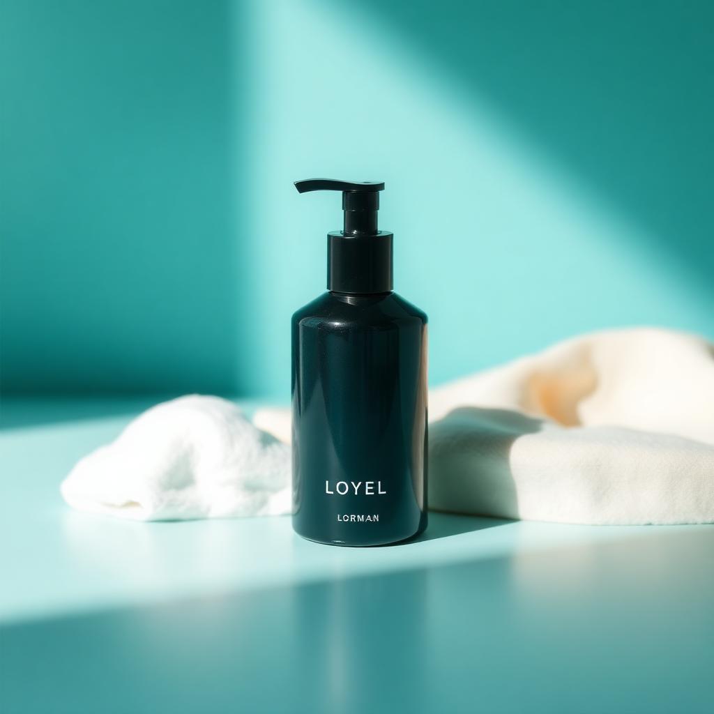
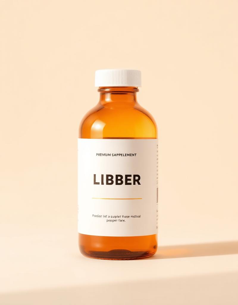
Packaging placed in realistic retail and unboxing scenes — premium uncoated cartons, glass bottles and tote bags — to validate shelf presence and gifting appeal.
Social media applications
- → Instagram product launch grid
- → D2C lifestyle campaign visuals
- → Influencer PR kit mailer
- → Story templates & reel covers
Print & packaging
- → Primary product packaging (bottles, tubes, cartons)
- → Business cards & visiting suite
- → Shopping bags & gift packaging
- → Brochures & in-store collateral
Before vs after
Replaced a generic green ‘organic’ visual language with a confident, premium wellness world — refined typography, intentional colour and packaging that finally earns its shelf price.
Final outcome & result
Full identity and packaging system delivered in under two weeks. Kudarat Care now reads as a premium wellness brand on shelf, and the client has cited a clearly improved retail reception and gifting demand post-rebrand.
A premium Indian wellness brand identity engineered to compete with global clean beauty labels — calm, confident and shelf-ready.
Applications
- →Logo system
- →Packaging design
- →Business cards
- →Shopping bags
- →Brand guidelines
Client feedback
“The new identity finally matches the quality of what we put inside our bottles. Kudarat Care feels like a real wellness brand now.”
— Founder, Kudarat Care
Have a brand worth building?
Let’s craft your next case study.
Branding, identity, packaging, print and digital — built for Indian businesses ready to look as serious as they actually are.
Next project →
SHREEMAY BUNGALOWS.
Real Estate • Brochure