
 Case study / 2025
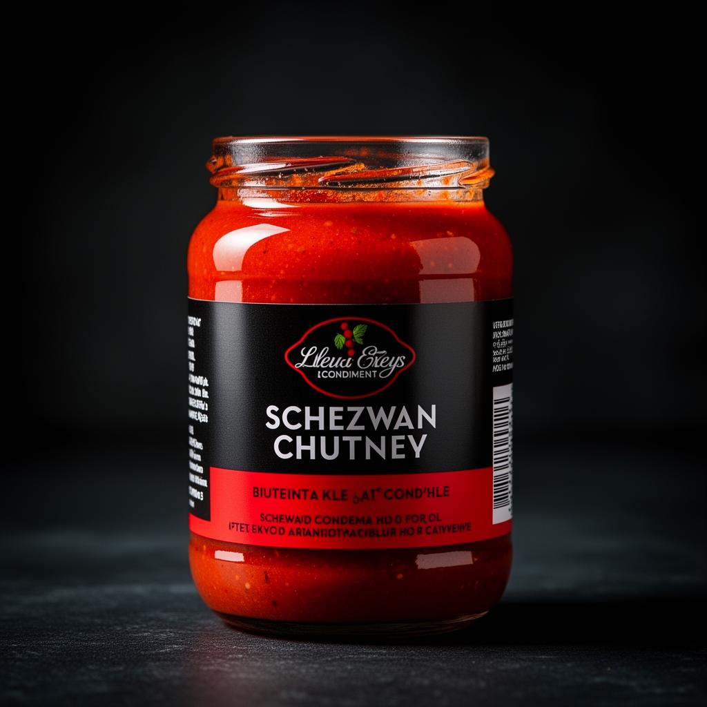
CRAVE EATABLES SCHEZWAN CHILLI CHUTNEY.
Crave Eatables — Bachubhai’s — Packaging • Condiments
Industry
Food & Beverage / FMCG Condiments & Sauces
Design style
Bold FMCG packaging, spicy and flavor-focused, modern food aesthetic, high-contrast attention-grabbing layout with premium branding.
Target audience
Fast-food and snack consumers, young adults, spicy food lovers, retail grocery shoppers, restaurants and cafés, and ready-to-use condiment buyers.
Project overview.
Bold, vibrant packaging artwork for Crave Eatables’ Schezwan Chilli Chutney. The packaging visually communicates spice, flavor and authenticity while holding strong shelf presence and a professional FMCG packaging structure — modern food aesthetics with clear product information and appealing visuals.
Client
Crave Eatables — Bachubhai’s
Year
2025
Discipline
Packaging • Condiments
Duration
3–5 Days
My role
Packaging & Graphic Designer — layout, visual direction, typography hierarchy, product styling, compliance arrangement and production-ready execution.
The client problem.
The client needed packaging that instantly attracts customers in a highly competitive condiment market while clearly showcasing flavor and maintaining brand consistency. The challenge was balancing strong visual appeal with organised nutritional, ingredient and compliance information.
Design goal.
Create eye-catching, premium packaging that reflects the bold, spicy personality of Schezwan Chilli Chutney while improving product visibility, readability and customer engagement in retail.
Our solution.
A high-contrast design built on vibrant red and yellow tones tied to spice, energy and appetite stimulation. Bold typography and a centered product hierarchy improve shelf visibility, while food visuals and Asian-inspired graphic elements strengthen identity. Ingredients, nutrition and barcode details are carefully structured for readability and balance.
The strategy.
Treat the jar like a billboard for heat. Lead with a saturated red-yellow contrast, hero the flavor, then nest information in a calm structural grid so it feels designed, not dumped.
Colour palette
- Vibrant Red#E31E24
- Bright Yellow#F5C518
- Dark Maroon#6A0D0D
- Clean White#FFFFFF
Typography
Bold sans-serif display typography for product hero
Clean sans-serif body font for ingredients and compliance
Logo concept
Modern FMCG branding meets spicy Asian-inspired food aesthetics. Bold color tones, food imagery and circular decorative patterns communicate flavor intensity, authenticity and product excitement while strengthening the Crave Eatables identity.
Design process
Step-by-step.
- 01
Product & market research
- 02
Flavor identity & visual exploration
- 03
Packaging layout planning
- 04
Typography & color selection
- 05
Product visual integration
- 06
Information hierarchy structuring
- 07
Print-ready artwork preparation
- 08
Final packaging review & refinement
Deliverables
- → Product packaging design
- → Print-ready packaging artwork
- → Nutritional information layout
- → Barcode & compliance placement
- → Flavor-based packaging system
Tools used
Mockup presentation
In the world.
Print & packaging
- → Schezwan chutney jar / pouch label
- → Compliance & nutrition layout
- → Print-ready CMYK artwork
Final outcome & result
The packaging captured the bold, spicy identity of the product. Vibrant colors and a professional layout helped the jar stand out strongly while keeping all important information clear — enhancing shelf presence and brand appeal.
A spicy, high-contrast condiment packaging system engineered to win the shelf and lift brand appeal.
Applications
- →Primary packaging
- →Flavor hero layout
- →Compliance & nutrition system
- →Print-ready artwork
Client feedback
“The packaging perfectly captured the bold and spicy identity of our Schezwan Chilli Chutney. The vibrant colors and professional layout made the product stand out while keeping all important information clear and easy to read.”
— Team, Crave Eatables — Bachubhai’s
Have a brand worth building?
Let’s craft your next case study.
Branding, identity, packaging, print and digital — built for Indian businesses ready to look as serious as they actually are.
Next project →
SOLANA ORIGIN.
Crypto • Identity