 Case study / 2025
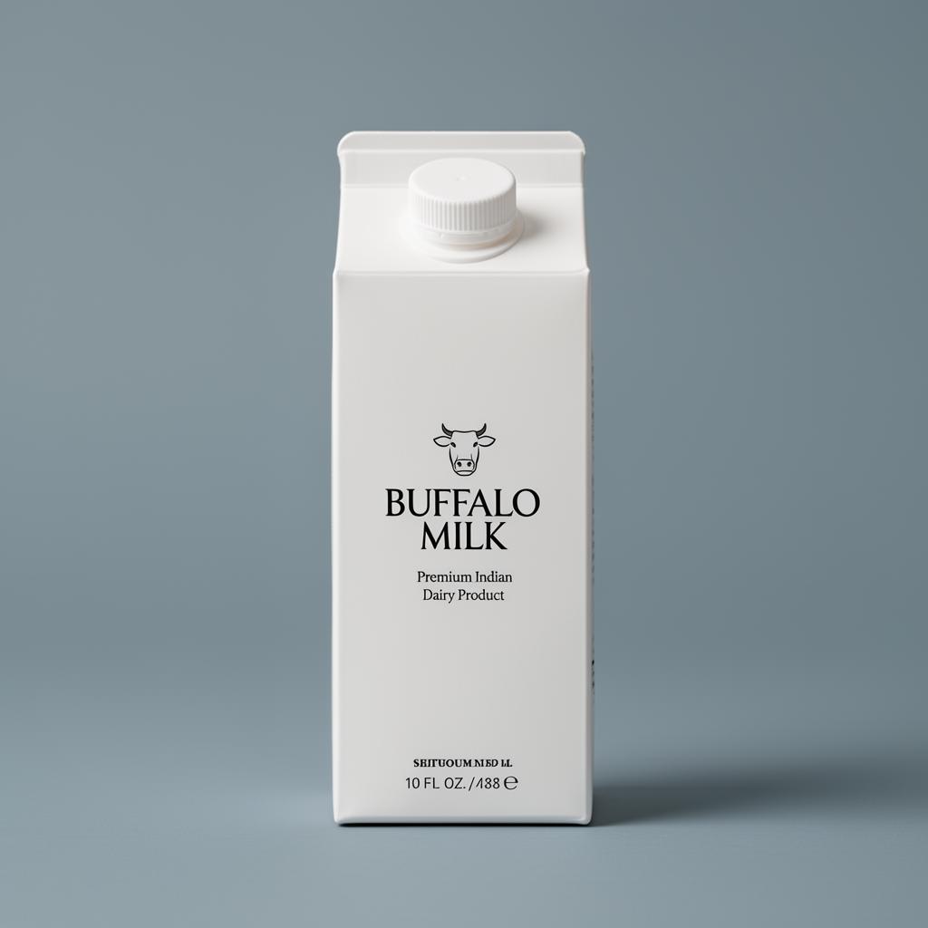
CRAVE EATABLES BUFFALO MILK.
Crave Eatables — Bachubhai’s — Packaging • Dairy
Industry
Food & Beverage / Dairy Products
Design style
Minimal dairy packaging, fresh and trustworthy, modern FMCG aesthetic, professional and consumer-friendly.
Target audience
Daily milk consumers, families, health-conscious buyers, retail grocery customers and traditional dairy product users.
Project overview.
Clean, professional packaging artwork for Crave Eatables’ Buffalo Milk product. The packaging focuses on freshness, purity and authenticity while maintaining a modern dairy brand identity — minimal yet impactful, with strong shelf presence and easy readability.
Client
Crave Eatables — Bachubhai’s
Year
2025
Discipline
Packaging • Dairy
Duration
3–4 Days
My role
Packaging & Graphic Designer — layout, typography hierarchy, visual styling, compliance arrangement and production-ready execution.
The client problem.
The client needed packaging that stands out in a competitive dairy market while remaining clean and trustworthy. The challenge was structuring mandatory packaging details — nutrition, ingredients, barcode, legal compliance — without making the design feel overcrowded.
Design goal.
Create a fresh, premium and consumer-friendly milk packaging design that highlights product quality, strengthens brand recognition and improves shelf visibility while staying clean and easy to understand.
Our solution.
A minimal, balanced layout built on clean spacing, strong typography hierarchy and fresh dairy-inspired color tones. The product name leads with bold typography; blue and green accents communicate freshness, purity and natural dairy quality; all compliance information is organised for clarity.
The strategy.
Treat the carton like a quiet billboard. Maximise product-name legibility from a distance, use color to signal freshness, and let structure carry the information weight.
Colour palette
- Fresh Blue#2D8CCB
- Natural Green#4C8B2B
- Deep Maroon#6A0D0D
- Clean White#FFFFFF
Typography
Bold sans-serif for the product name
Clean sans-serif body font for ingredients and compliance
Logo concept
Traditional dairy branding meets modern retail. Buffalo imagery, fresh color tones and bold typography communicate authenticity, richness and the trust associated with premium buffalo milk.
Design process
Step-by-step.
- 01
Product & packaging research
- 02
Information hierarchy planning
- 03
Typography & layout exploration
- 04
Dairy-inspired color selection
- 05
Packaging structure design
- 06
Nutritional & compliance arrangement
- 07
Print-ready artwork preparation
- 08
Final quality & readability review
Deliverables
- → Milk packaging label design
- → Print-ready packaging artwork
- → Nutritional information layout
- → Barcode & compliance placement
- → Brand-aligned packaging design system
Tools used
Mockup presentation
In the world.
Print & packaging
- → Buffalo milk carton / pouch label
- → Compliance & nutrition layout
- → Print-ready CMYK artwork
Final outcome & result
The artwork gave the product a clean, premium appearance while keeping every piece of information in a very organised way — helping the product stand out more confidently in the retail market.
A minimal Buffalo Milk packaging system built for shelf clarity and modern dairy trust.
Applications
- →Primary packaging
- →Compliance information layout
- →Print-ready artwork
Client feedback
“The packaging design gave our product a clean and premium appearance while maintaining all important information in a very organized way. The final artwork looks professional, fresh, and trustworthy.”
— Team, Crave Eatables — Bachubhai’s
Have a brand worth building?
Let’s craft your next case study.
Branding, identity, packaging, print and digital — built for Indian businesses ready to look as serious as they actually are.
Next project →
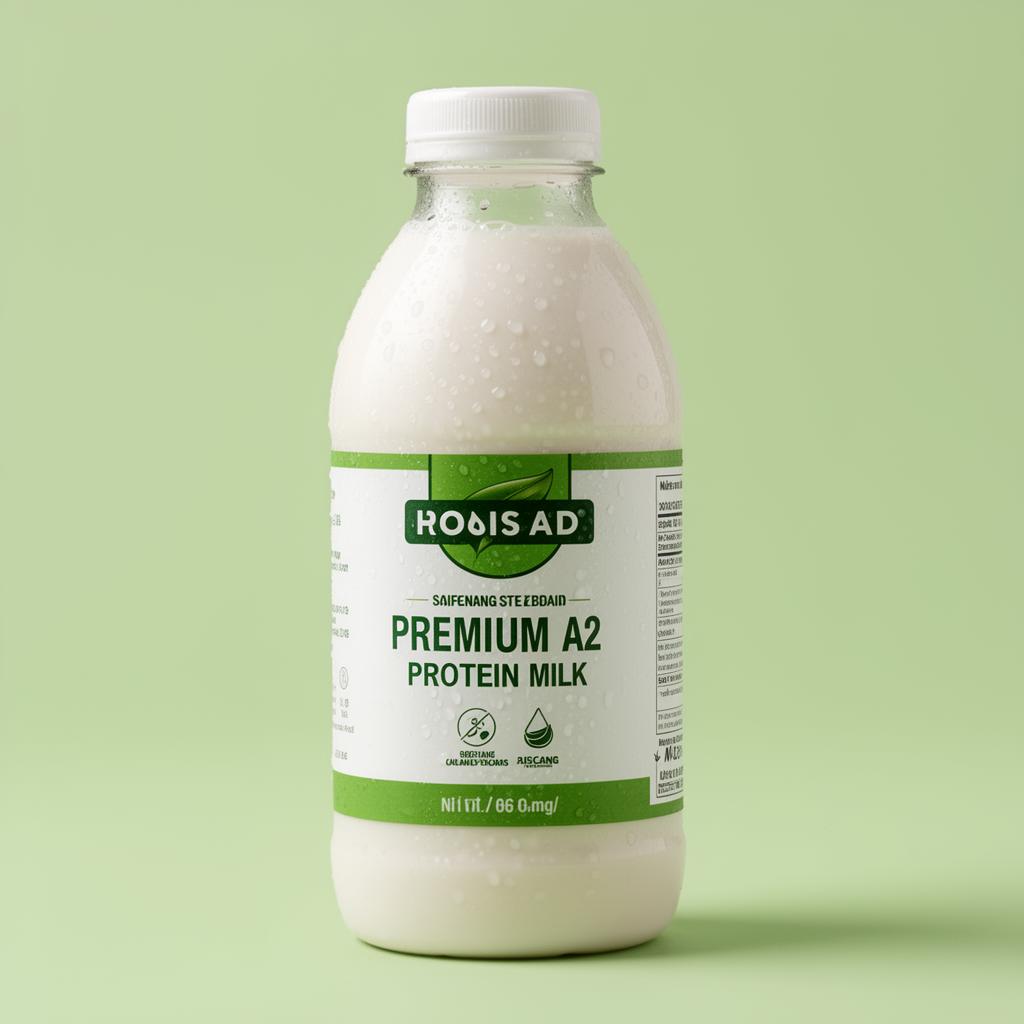
CRAVE EATABLES A2 PROTEIN MILK.
Packaging • Dairy